
渐变
一、线性渐变
1线性渐变格式
linear-gradient([<起点> || <角度>,]? <点>, <点>…)
只能用在背景上
2IE filter:progid:DXImageTransform.Microsoft.gradient(startColorstr='#ffffff',endColorstr='#ff0000',GradientType='1');
<style>
.box{width:300px;height:300px;background:-webkit-linear-gradient(red,blue);background:-moz-linear-gradient(red,blue);background:linear-gradient(red,blue);filter:progid:DXImageTransform.Microsoft.gradient(startColorstr='red',endColorstr='blue',GradientType='0');}
</style>
</head>
<body>
<divclass="box"></div>
</body>
3参数
起点:从什么方向开始渐变 默认:top
left、top、left top
从上到下
<style>
.box{width:300px;height:300px;border:10pxsolid #000; background-image:-webkit-linear-gradient(red,blue);}
</style>
</head>
<body>
<divclass="box"></div>
</body>
角度:从什么角度开始渐变
xxx deg的形式
逆时针
.box{width:300px;height:300px;border:10pxsolid #000; background-image:-webkit-linear-gradient(60deg,red,blue);}
</style>
</head>
<body>
<divclass="box"></div>
</body>
点:渐变点的颜色和位置
black 50%,位置可选
<style>
.box{width:300px;height:300px;border:10pxsolid #000; background-image:-webkit-linear-gradient(60deg,red,blue,yellow,blue);}
</style>
</head>
<body>
<divclass="box"></div>
</body>
<style>
.box{width:300px;height:300px;border:10pxsolid #000; background-image:-webkit-linear-gradient(60deg,red0,blue 50%,green 100%);}
</style>
</head>
<body>
<divclass="box"></div>
</body>
4repeating-linear-gradient
<style>
.box{width:300px;height:300px;border:10pxsolid #000; background-image:-webkit-repeating-linear-gradient(60deg,red0,blue 30px);}
</style>
</head>
<body>
<divclass="box"></div>
</body>
5线性渐变实例
加入点的位置
top, red 40%,green 60%
top, red 50%,green 50%
同一个位置两个点——直接跳变
也可以用px
配合rgba
top,rgba(255,255,255,1), rgba(255,255,255,0)
加入背景图片
background: -webkit-linear-gradient (top, rgba(255,255,255,1) 30%,rgba(255,255,255,0)), url(a.gif)
6实例1:进度条
<style>
.wrap{width:200px;height:30px;overflow:hidden;border:1pxsolid #000;}
.box{width:400px;height:30px;background:-webkit-repeating-linear-gradient(15deg,green0,green 10px,#fff 10px,#fff 20px); transition:3s;}
.wrap:hover .box{margin-left:-100px;}
</style>
</head>
<body>
<divclass="wrap">
<divclass="box"></div>
</div>
</body>
鼠标移上,向左运动,实现类似进度条的效果
7实例2:百度音乐图片光影效果
1.
<style>
.box{width:300px;height:300px;background:-webkit-linear-gradient(-30deg,rgba(255,255,255,0)0,rgba(255,255,255,0) 150px,rgba(255,255,255,1) 170px,rgba(255,255,255,1)180px,rgba(255,255,255,0) 210px) no-repeat,url(new_bg.png) no-repeat;transition:1s;}
</style>
</head>
<body>
<divclass="box"></div>
</body>
2.
鼠标移上,运动起来
<style>
.box{width:300px;height:300px;background:-webkit-linear-gradient(-30deg,rgba(255,255,255,0)0,rgba(255,255,255,0) 150px,rgba(255,255,255,1) 170px,rgba(255,255,255,1)180px,rgba(255,255,255,0) 210px) no-repeat-200px 0,url(new_bg.png)no-repeat; transition:1s;}
.box:hover{background-position:300px0,-100px -100px;}
</style>
</head>
<body>
<divclass="box"></div>
</body>
<!DOCTYPE HTML>
<html>
<head>
<meta http-equiv="Content-Type" content="text/html; charset=utf-8">
<title>无标题文档</title>
<style>
#div{
width:400px;
height:220px;
margin:20px 0;
color:#fff;
/*直接使用background缩放版本*//*每个渐变点的位置不能太小,不然会出现残缺光斑*//*no-repeat -270px 0:将光斑定位隐藏起来*/background:-webkit-linear-gradient(-30deg, rgba(255, 255, 255, 0)0, rgba(255, 255, 255, 0)230px, rgba(255, 255, 255, 0.1)260px, rgba(255, 255, 255, 0.1)270px, rgba(255, 255, 255, 0)300px, rgba(255, 255, 255, 0)310px) no-repeat -270px 0, url(new_bg.png) no-repeat;
transition:1s;
}
#div:hover{
/*鼠标滑过实现光斑滑动,但是在多背景情况下,需要多个background-position属性值,否则会影响其他背景*/background-position:200px 0, 0 0;
}
</style>
</head>
<body>
<div id="div">
</div>
</body>
</html>
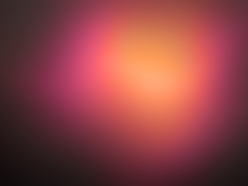
二、径向渐变
radial-gradient([<起点>]? [<形状> || <大小>,]? <点>, <点>…);
起点:可以是关键字(left,top,right,bottom),具体数值或百分比
形状: ellipse、circle
大小 :具体数值或百分比,也可以是关键字(最近端,最近角,最远端,最远角,包含或覆盖 (closest-side, closest-corner,farthest-side, farthest-corner, contain or cover));
注意firefox目前只支持关键字
<style>
.box{width:200px;height:200px;background:-webkit-radial-gradient(red,blue);}
</style>
</head>
<body>
<divclass="box"></div>
</body>
<style>
.box{width:200px;height:200px;background:-webkit-radial-gradient(100px50px,red,blue);}
</style>
</head>
<body>
<divclass="box"></div>
</body>
<style>
.box{width:200px;height:200px;background:-webkit-radial-gradient(100px50px,circle,red,blue);}
</style>
</head>
<body>
<divclass="box"></div>
</body>
<style>
.box{width:200px;height:200px;background:-webkit-radial-gradient(100px50px,100px 20px,red,blue);background:-moz-radial-gradient(100px50px,red,blue);}
</style>
</head>
<body>
<divclass="box"></div>
</body>
径向渐变的关键字
<style>
.box{width:300px;height:300px;border:1pxsolid #000;float:left;margin:10px;}
.box:nth-child(1){background:-webkit-radial-gradient(100px 50px,closest-side,red,blue);}
.box:nth-child(2){background:-webkit-radial-gradient(100px 50px,closest-corner,red,blue);}
.box:nth-child(3){background:-webkit-radial-gradient(100px 50px,farthest-side,red,blue);}
.box:nth-child(4){background:-webkit-radial-gradient(100px 50px,farthest-corner,red,blue);}
.box:nth-child(5){background:-webkit-radial-gradient(100px 50px,contain ,red,blue);}
.box:nth-child(6){background:-webkit-radial-gradient(100px 50px,cover ,red,blue);}
</style>
</head>
<body>
<divclass="box"></div>
<divclass="box"></div>
<divclass="box"></div>
<divclass="box"></div>
<divclass="box"></div>
<divclass="box"></div>
</body>