版本:Qt5.12.5 ,参考Qt源码及文档示例
代码链接:/gongjianbo/QmlComponentStyle.git
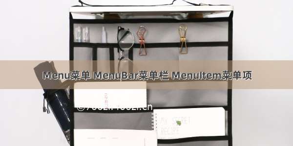
在Qt5.12的文档中你可以搜索到三个MenuBar组件,这里我修改的是Control2中的菜单栏样式,对比如下:
因为菜单栏及菜单项是多个组件组合而成的,都需要进行了自定义来统一风格:
样式修改也没什么好讲的,就那几个固定的设置,要做的就是改改属性参数来实现界面效果。QML这个MenuBar有个好处就是能随便放在哪个位置,Menu也可以单独作为弹出式的菜单。直接放代码:
//basicmenu.qml
//basicmenu.qmlimport QtQuick 2.12import QtQuick.Controls 2.12import QtQuick.Controls.impl 2.12import QtQuick.Templates 2.12 as Timport QtQuick.Window 2.12T.Menu {id: controlproperty color borderColor: "black"property color backgroundColor: "white"implicitWidth: Math.max(implicitBackgroundWidth + leftInset + rightInset,contentWidth + leftPadding + rightPadding)implicitHeight: Math.max(implicitBackgroundHeight + topInset + bottomInset,contentHeight + topPadding + bottomPadding)margins: 0overlap: 1font{family: "SimSun"pixelSize: 14}delegate: BasicMenuItem { }contentItem: ListView {implicitHeight: contentHeightmodel: control.contentModelinteractive: Window.window ? contentHeight > Window.window.height : falseclip: truecurrentIndex: control.currentIndexScrollIndicator.vertical: ScrollIndicator {}}background: Rectangle {implicitWidth: 122implicitHeight: 32color: control.backgroundColorborder.width: 1border.color: control.borderColor}T.Overlay.modal: Rectangle {color: Color.transparent(control.palette.shadow, 0.5)}T.Overlay.modeless: Rectangle {color: Color.transparent(control.palette.shadow, 0.12)}}
//basicmenubar.qml
//basicmenubar.qmlimport QtQuick 2.12import QtQuick.Templates 2.12 as Timport QtQuick.Controls 2.12import QtQuick.Controls.impl 2.12T.MenuBar {id: controlproperty color backgroundColor: "white"property color borderColor: "black"implicitWidth: Math.max(implicitBackgroundWidth + leftInset + rightInset,contentWidth + leftPadding + rightPadding)implicitHeight: Math.max(implicitBackgroundHeight + topInset + bottomInset,contentHeight + topPadding + bottomPadding)font{family: "SimSun"pixelSize: 16}delegate: BasicMenuBarItem { }contentItem: Row {spacing: control.spacingRepeater {model: control.contentModel}}//背景在MenuBarItem之下,我把MenuBarItem的background高度去了1pxbackground: Rectangle {implicitHeight: 30color: control.backgroundColorRectangle {color: control.borderColorwidth: parent.widthheight: 1anchors.bottom: parent.bottom}}}
//basicmenubaritem.qml
//basicmenubaritem.qmlimport QtQuick 2.12import QtQuick.Templates 2.12 as Timport QtQuick.Controls 2.12import QtQuick.Controls.impl 2.12T.MenuBarItem {id: controlproperty color textColor: control.highlighted ? "cyan" : "white"property color backgroundColor: control.down || control.highlighted ? "black" : "gray"implicitWidth: Math.max(implicitBackgroundWidth + leftInset + rightInset,implicitContentWidth + leftPadding + rightPadding)implicitHeight: Math.max(implicitBackgroundHeight + topInset + bottomInset,implicitContentHeight + topPadding + bottomPadding,implicitIndicatorHeight + topPadding + bottomPadding)//spacing: 6padding: 0leftPadding: 12rightPadding: 12//icon.width: 24//icon.height: 24//icon.color: control.palette.buttonTextcontentItem: Text {text: control.textfont: control.font//opacity: enabled ? 1.0 : 0.3color: control.textColorhorizontalAlignment: Text.AlignLeftverticalAlignment: Text.AlignVCenterrenderType: Text.NativeRenderingelide: Text.ElideRight}background: Rectangle {implicitHeight: 30height: control.height-1color: control.backgroundColor}}
//basicmenuitem.qml
//basicmenuitem.qmlimport QtQuick 2.12import QtQuick.Controls 2.12import QtQuick.Controls.impl 2.12import QtQuick.Templates 2.12 as Timport QtQuick.Shapes 1.12T.MenuItem {id: controlproperty color textColor: control.highlighted ? "cyan" : "black"property color buttonColor: control.down ? "black": control.highlighted ? "gray": "transparent"property color indicatorColor: "black"property color arrowColor: "black"implicitWidth: Math.max(implicitBackgroundWidth + leftInset + rightInset,implicitContentWidth + leftPadding + rightPadding)implicitHeight: Math.max(implicitBackgroundHeight + topInset + bottomInset,implicitContentHeight + topPadding + bottomPadding,implicitIndicatorHeight + topPadding + bottomPadding)padding: 0spacing: 6contentItem: Text {readonly property real arrowPadding: control.subMenu && control.arrow ? control.arrow.width + control.spacing : 0readonly property real indicatorPadding: control.checkable && control.indicator ? control.indicator.width + control.spacing : 0readonly property real left_pd: !control.mirrored ? indicatorPadding : arrowPadding//没有边距就贴在边上了leftPadding: left_pd<=0?6:left_pdrightPadding: control.mirrored ? indicatorPadding : arrowPaddinghorizontalAlignment: Text.AlignLeftverticalAlignment: Text.AlignVCenterrenderType: Text.NativeRenderingtext: control.textfont: control.fontcolor: control.textColor}indicator: Item {x: control.mirrored ? control.width - width - control.rightPadding : control.leftPadding//y: control.topPadding + (control.availableHeight - height) / 2implicitWidth: 30implicitHeight: 30Rectangle {width: parent.width-8height: widthanchors.centerIn: parentvisible: control.checkableborder.width: 1border.color: control.indicatorColorRectangle {width: parent.width-8height: widthanchors.centerIn: parentvisible: control.checkedcolor: control.indicatorColor}}}arrow: Shape {id: item_arrowx: control.mirrored ? control.leftPadding : control.width - width - control.rightPadding//y: control.topPadding + (control.availableHeight - height) / 2visible: control.subMenuimplicitWidth: 30implicitHeight: 30ShapePath {strokeWidth: 0strokeColor: control.arrowColorfillRule: ShapePath.WindingFillfillColor: control.arrowColorstartX: item_arrow.width/4startY: item_arrow.height*3/4PathLine { x:item_arrow.width/4; y:item_arrow.height/4 }PathLine { x:item_arrow.width/2; y:item_arrow.height/2 }PathLine { x:item_arrow.width/4; y:item_arrow.height*3/4 }}}background: Rectangle {implicitWidth: 120implicitHeight: 30x: 1y: 1width: control.width - 2height: control.height - 2color: control.buttonColor}}
//basicmenuseparator.qml
//basicmenuseparator.qmlimport QtQuick 2.12import QtQuick.Controls 2.12import QtQuick.Controls.impl 2.12import QtQuick.Templates 2.12 as TT.MenuSeparator {id: controlproperty color contentColor: "black"property color backgroundColor: "transparent"implicitWidth: Math.max(implicitBackgroundWidth + leftInset + rightInset,implicitContentWidth + leftPadding + rightPadding)implicitHeight: Math.max(implicitBackgroundHeight + topInset + bottomInset,implicitContentHeight + topPadding + bottomPadding)padding: 0topPadding: 4bottomPadding: 4contentItem: Rectangle {implicitWidth: 120implicitHeight: 1color: contentColor}background: Rectangle{color: backgroundColor}}
//main.qml 使用
MenuBar{width: 600Menu{title: "MenuA"Action{ text: "A"; checkable: true; checked: true }Action{ text: "B"; checkable: true; }MenuSeparator{}Menu{title: "C"Action{ text: "A" }Action{ text: "B" }}}Menu{title: "Menu Test"Action{ text: "A" }Action{ text: "B" }}}BasicMenuBar{width: 600height: 30BasicMenu{title: "MenuA"Action{ text: "A"; checkable: true; checked: true }Action{ text: "B"; checkable: true; }BasicMenuSeparator{ }BasicMenu{title: "C"Action{ text: "A" }Action{ text: "B" }}}BasicMenu{title: "Menu Test"Action{ text: "A" }Action{ text: "B" }}}